Midwest BunFest 2022 Logo Design
I was given the opportunity to design the logo for the 2022 Midwest BunFest. I had several design check-ins with my client, one of the event organizers, to reach a mutual understand of what the logo needed to look like and convey.
First Interaction
The first time my client reached out to me, she made it clear that she wanted the venue incorporated in the design. The event was being held at a hotel, which was a different venue from all the events years prior.
She wanted the words “hotel” and “hop” to be included in a saying for the logo design.
Brainstorm
I felt that, “It’s Hopping at the Hotel” was a fitting saying to use.
As for ideas for the visual, I had several ideas involving a bunny in a bellhop uniform:
Bellhop bunny pushing other bunnies on a hotel cart
Bellhop bunny carrying carrot-pattern suitcases
Bellhop bunny sitting on a suitcase
Other ideas:
5 carrots (like a 5-star hotel)
Suitcases overflowing with carrots
A bunny sitting in an open suitcase, eating carrots
Second Interaction
I spoke to my client on the phone to update her on my ideas.
I told her what I had come up with. Although she thought the bellhop bunny would be cute, she believed the concept would alienate the event goers that were not staying at the hotel. She expressed her ideas:
Have bunnies hopping around the hotel
Hotel lobby with bunnies
The client also made it clear how the words needed to be placed, and how orange and blue would be on-theme for the event. I was told to email her when my rough drafts were completed.
Brainstorm
Bunnies exploring suitcases (the client didn’t say anything negative about this idea so I wanted to include it)
A non-proportional hotel from the outside with bunnies taking over it (piles of bunnies in front, on the roof, etc.)
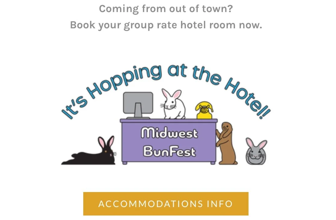
A reception desk with bunnies
Draft
Third Interaction
The client had said she deliberated with other event organizers and chose the “hotel being taken over by bunnies” visual. She mentioned potentially using the “reception desk” visual somewhere on the event website too.
Another contact reached out to me to give me the proper hex codes for the desired blue and orange for the final logo design.
I felt that the bunny “heads” of the chosen visual draft were a bit sloppy and thrown together. I decided to clean up the draft and make a version with whole bunnies to see which would work best for the final logo.
Refine
Final Interaction
I personally preferred the design with whole bunnies. I reached out to my client to see what she thought; she liked the changes and had given me the go ahead to send the design in the proper formats for both print and web.


